Making Pre Join Effortless for Everyone
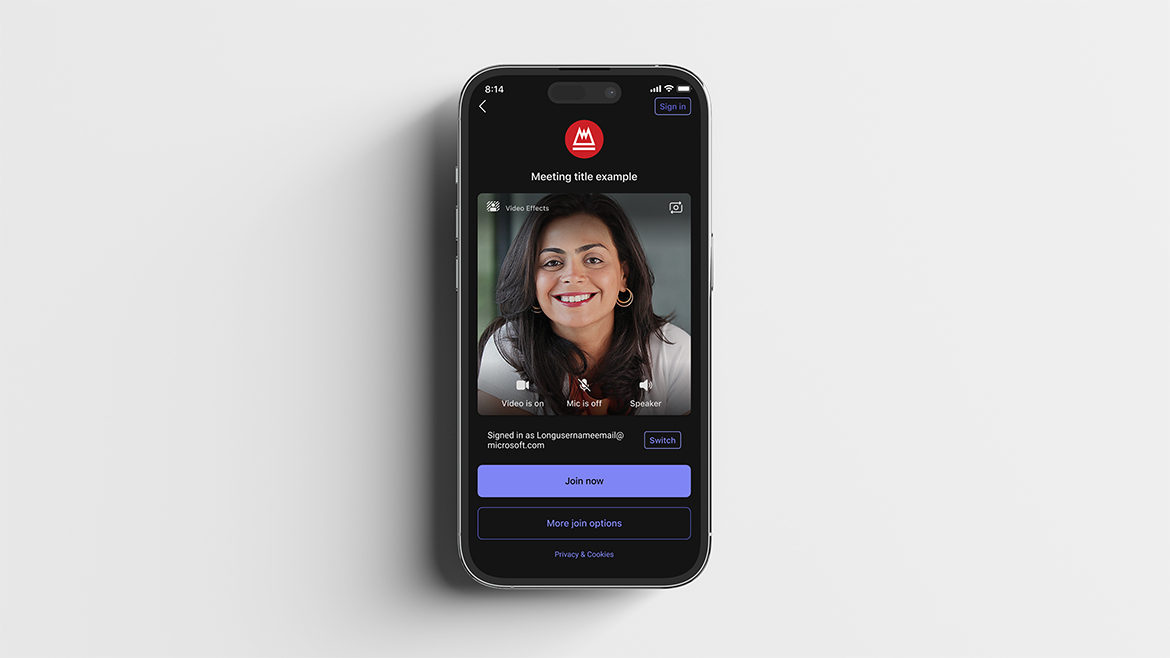
What if joining a meeting on mobile felt so simple and intuitive that even first time users could step in instantly, no instructions, no friction, just human connection?
Problem: In the early versions of Microsoft Teams on mobile, joining a meeting was far more complicated than it needed to be. Users who received an invitation link but did not have Teams installed were often met with a long, confusing sequence of screens. This created friction, drop off, and frustration at one of the most critical moments in the user journey. Many first time participants simply gave up or chose competing products because they offered a faster, more straightforward pre join experience. These patterns highlighted a strategic gap: if entering a meeting feels difficult, the platform loses trust before the experience even begins.
Solution: I led a redesign of the mobile pre join experience with a clear goal: make joining a meeting effortless for anyone, regardless of whether they had Teams installed. After analyzing competitive flows, we found that most platforms required only two to four steps to enter a meeting. Using these insights, we restructured the entire funnel, removing nearly forty percent of unnecessary screens and consolidating essential actions into a streamlined two step flow. The new experience integrated audio and video setup up front, reduced cognitive load, and eliminated repeated or redundant decisions. As a result, we saw a significant improvement in completion rates and a sixty five percent reduction in users abandoning Teams due to perceived complexity. Feedback from external participants revealed that the redesigned flow felt not only faster but in some cases even simpler than competing meeting platforms. The outcome was a more welcoming, intuitive, and inclusive entry point into the Teams ecosystem.
CLIENT
Microsoft
PROJECT
Teams